
The projects (clickable)
What did i do?
We were given a choice between budget, organic, or deluxe brand styles, and I opted for the deluxe option.
Moodboard/Feeling, Font choice.
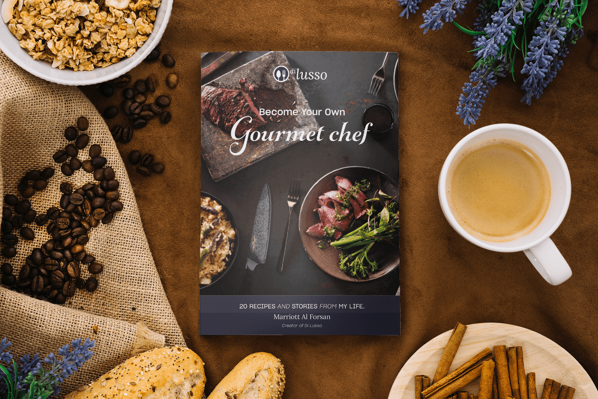
My vision was to create a cookbook that catered to the highest end of the market, without reaching the level of the Alchemist restaurant, which boasts a darker, more opulent aesthetic and features fewer recipes and more high-end ingredients. For my cookbook, I aimed to focus on simple yet refined recipes and upscale food products. I envisioned a color scheme that incorporated dark blues, white, black, and metallic shades such as gold and silver.
When it comes to the fonts, I aimed for a mix of basic and more elaborate styles. Specifically, I planned to use a bold and eye-catching script font for the title, which I have utilized across various platforms promoting the concept of “Become your own Gourmet Chef.”
Logo
When it came to naming the project, I didn’t opt for anything particularly original. I noticed that many successful restaurant names are simply basic words translated into another language, so I chose the word “Deluxe” and translated it to Italian, becoming “Di Lusso.” To create an appropriate icon, I chose an old royal spoon and fork to match the style of Royal Copenhagen.
Website / Facebook site
I aimed for a clean and straightforward design for the website, with a focus on compelling calls-to-action (CTAs) to encourage visitors to order the book. I carried over the same design style to the Facebook page, with the ultimate goal of directing people to the website to complete the order process and secure a copy of the book.
App
I aimed for simplicity and practicality in designing this feature. With just a single button, you can easily add all the ingredients needed for a dish into your shopping cart. And when it’s time to cook, a Tasty-style video will play as soon as you click ‘Start Cooking’.


